Avery Phillips
Avery T. Phillips is a freelance human being with too much to say. She loves nature and examining human interactions with the world. Comment or tweet her with any questions or suggestions.
Not only is a disability-friendly user experience very much attainable for companies willing to invest the time and effort into the pursuit, it’s a smart business move.
For the designer, user experience typically means a marriage of visual components and practical tools that come together to create an enjoyable, intuitive interface for those who visit a site. The reality, though, is that those perceptions often don’t include the individuals whose experience of the world differs due to disabilities.
Principal Accessibility Specialist at Salesforce, Jesse Hausler, wrote for Medium, “Accessibility enables people with disabilities to perceive, understand, navigate, interact with, and contribute to the web. Imagine a world where developers know everything there is to know about accessibility. You design it and they build it … perfectly. In this world, only the design itself can cause people with disabilities to have trouble using a product.”
Those with visual and mobility impairments are not going to assess user experience the same as others, yet designers must consider how they can optimize a site for everyone who is going to use it. Those without experience may find the task daunting, but the reality is that some fairly straightforward steps can create a positive user experience across the board.
The reality is a web designer who is good at their job is a web designer that creates an inclusive experience for a diverse set of users. If only some can enjoy the experience, then a web designer should be asking themselves if they can do better, and a lot of the time the answer is they can.
As user experience designer Jennifer Smith writes for American Graphics Institute, “In a successfully implemented accessible user experience design, all users, regardless of any impairments, are able to complete tasks on the website. If the primary objective of a user is to submit an inquiry, buy a product, or gather information, this should be possible for all users.”
There are plenty of reasons an organization should invest time and effort into creating a web space that is as inclusive as possible.
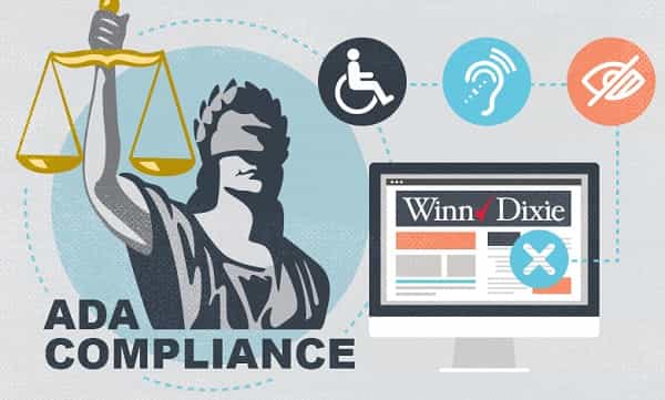
The American Disabilities Act (A.D.A.) came into practice in 1990, and at that point the internet wasn’t included in the conversation; thus websites are not legally obligated to adhere to the A.D.A. Now, given the way technology continues to alter how we conduct all kinds of business, a web designer has the tools they need to make a site disability friendly and not only that, but there is an increasing expectation that a site should be A.D.A. compliant.

Despite the fact that unless you’re operating a federal website, which must be accessible for those with and without disabilities alike, you’re not required to create an A.D.A. compliant website, there is a clear societal push for even privately owned and operated websites to be held accountable under the legislation.
According to Mark Pulliam for The Los Angeles Times, “It began in 2000 when Bank of America became the first entity to settle a web-accessibility lawsuit. Safeway and Charles Schwab soon followed suit. In 2008, Target paid $6 million to settle a class-action suit brought by the National Federation of the Blind and nearly $4 million more to cover the plaintiffs' attorney fees and other costs. More than 240 businesses across the country have been sued in federal court over website accessibility since the beginning of 2015.”
Thus, websites are being held accountable for a lack of accessibility within the elements of their design. A case could be made for the fact that websites that are accessible to all become more desirable to all within society because of their commitment to the values of society as a whole.
Additionally, diluting this topic down to merely the legal requirements is a disservice to both site owners and site users. Those with impairments are every bit as valuable in terms of their ability to contribute and their value to organizations as other consumers.
If a company is truly committed to growing, they’re not going to create an unnecessary divide between themselves and potential consumers. Essentially, your brand’s power depends upon it.
As Shade Digital writes, “From the perspective of digital commerce, a strong brand means more traffic at a lower cost with higher conversion rates.”
As the New Jersey Institute of Technology reports, “Consumers identify with your company more when you actively define your public image. Familiarity and positive opinion can enhance buyer loyalty. By creating a consistent theme across all printed and digital media, you can create a business identity that clients relate to positively.”
Your brand’s image, and by extension future health, requires that your organization pay attention to the values and priorities of the society it depends upon for conversions. And in this case specifically, that means valuing individuals with disabilities as much as you do the non-disabled
Changes made to some of the standard elements of a website can create a world of difference for users. The striking thing about optimizing a website with accessibility in mind is that there is virtually no negative impact on other users. Instead, what other users often find is that their own experience becomes better.
Developing a policy for web accessibility ensures the ideals within the policy are built into your company structure and are clearly outlined as a component of who you are as a company.
After you’ve created a policy and made accessibility-minded changes to your site, outline those changes to the site for customers to view. Create a clear picture of how your site accommodates.
The best way to ensure continued progress for your site is to make it easy for those who need accommodations to tell you how your site is doing. Thus, you should open the site to accessibility-related feedback. Invite it, and when you get it, respond to it.
At this point in time, the technology doesn’t exist to create a website that manages to account for every type of disability and impairment. However, there are some common components of every website that can be optimized for accessibility.
Images: Utilize alt tags to create a succinct and clear description of all images on a page. Screen readers read the alt tags to users with visual impairments. Thus, if a site doesn’t use them, a visually impaired user will not have access to the image.
Videos: Video content should include subtitles and transcripts.
Labels: Whenever possible, create informative labels for items on the page. When embedding links, use anchor text that describes the landing page. If you have forms such a search bar, label it with search outside of the form itself.
Colors: Use colors that contrast. Black on white is the most used because it is the easiest for all users to see. Be especially wary of blue, green, and yellow used close together as those colors are typically most difficult for colorblind users.
Acronyms: If utilizing an acronym, separate each letter with a period. Otherwise, a screen reader will read “Ada”, instead of “A-D-A.”
Keyboard: A keyboard interface should be usable for content navigation.
The U.S. Department of Health and Human Services has created an accessibility checklist that any designer can use to assess their site, and the Web Accessibility Initiative has a curated list of tools that you can use to check a site’s accessibility.
As technology continues to remove barriers and to make web development more and more inclusive and intuitive, web designers have fewer reasons not to create user experiences that accommodate all.
Not only is a disability-friendly user experience very much attainable for companies willing to invest the time and effort into the pursuit, it’s a smart business move. It means more individuals become customers, simply because they have the ability to do so, and it also means that your brand’s image overall improves across demographics.
You’ll also receive some of our best posts today

Avery T. Phillips is a freelance human being with too much to say. She loves nature and examining human interactions with the world. Comment or tweet her with any questions or suggestions.
Video content has become an integral part of our...
Did you know that 61% of people prefer to be contacted...
Forging a strong and lasting business partnership is oftentimes...

User reviews are a game-changer for e-commerce. Consumers rely heavily o...
Don’t miss the new articles!