Sam Makad
Sam Makad is a business consultant. He helps small & medium enterprises to grow their businesses and overall ROI. You can follow Sam on Twitter, Facebook, and Linkedin.
E-commerce magnitude have grown exponentially in recent years but so has shopping desertion rate, resulting in huge loss for eCommerce players. In the context of ecommerce its all about how a retail company manages the experiences and interactions a customer has across its online shop.
The E-commerce Customer Journey: Understanding the Basics
Ever heard of the e-commerce store, Keus, that dares to think out of the box or, in their case, lines? Its playful and casual website layout offers horizontal scroll features and sideways navigation. Go figure.
An out-and-out crazy e-commerce website, Studio Job, ups the "quirk ante" and sells art objects. This website has everything from in-your-face visuals and humorous content to unimaginable micro-interactions.
An e-commerce experience that's organic and conversational. That's Femme & Fierce for you.
An e-commerce shoe store, Toms, becomes a million-dollar entity by giving away thousands of shoes. How so? They hit gold by integrating audience engagement and social outreach programs into their marketing strategy.
And all these extraordinary examples are just the tip of the iceberg when transforming the customer experience. Don't believe us? Get this:
Lateral thinking. Check.
Innovative CX. Check.
Creating a dent in the hyper-competitive e-commerce universe, check.
As you may have guessed, today, we will look at how big or small brands have been enriching their customer journey from start to finish. Here are four handy tips to get you started:
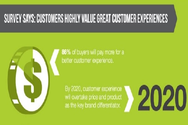
First things first, let's jump right into the numbers that matter and look at how e-commerce profitability gets affected due to positive and negative customer experiences:
Positive Customer Experiences:
Negative Customer Experiences:
Key Takeaway: The "customer experience-ROI" dynamics are as polarized as it is prevalent. Your brand may be, knowingly or unknowingly, experiencing "unexplained" highs and lows. If this is the case, it's time to return to the drawing board and revisit your CX strategies with a magnifying glass and laser-eye focus.
A user's journey is how they interact with the brand before purchasing. It includes six stages that ultimately define the customer service landscape. These include:
In this stage, the customer is getting to know the brand. They'll bounce all over the place and try to gather as much information as possible about your brand.
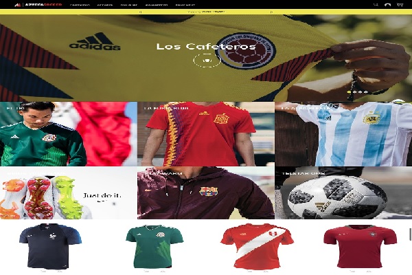
First impressions, or "first clicks," can make all the difference. Take, for instance, Azteca Soccer’s homepage, which offers a 360-degree view of the products and combines great photography and bright colors to reel the readers in.
Why it matters:
A consistent and coherent homepage can empower customers to understand the options that are available at their disposal and whether or not they want to pursue the offering further.
You can use quantitative tools to understand buyer behavior/patterns at this stage. Also, remember that a user typically gets on your website through powerful social media campaigns or PPC advertising campaigns, so make sure the messaging and branding stay aligned.
In this stage, the customers are weighing their options so that they may get "filtered."
To help customers feel more connected with the brand and make faster decisions, provide all the requisite knowledge, offers, contact support, and deals they think the customer will need.
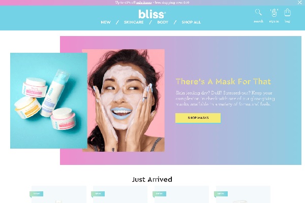
Bliss channels equal fun and knowledge to deliver a single-page, easily accessible website. Plus, it helps to bring the whole experience together by placing interactive images on the home page.
Why it matters:
A well-organized and super-categorized platform gives customers the freedom, space, and flexibility to choose what they like/dislike.
Typically, this is where the tectonic shift from low to high intent occurs, and the customer starts to decide. In a sense, it is an extension of the "Consideration" phase.
Consider the example shown below. Once the customer has browsed through the products and narrowed the choices to a specific one they like, they will add items to the cart. They’re now moving towards the concluding stages of the buying process.
Why it matters:
Creatively inclined online platforms that are amped up with great graphics and on-point product/service knowledge can empower customers to make an informed purchase decision. This instills greater user confidence and extends a feel-good factor throughout the purchase cycle.
This is the stage where the customer "checks out" and purchases as he likes. This is the end goal every e-commerce brand hopes to achieve with first-time and repeat buyers, that too, as seamlessly and conveniently as possible.
How positive customer experience impacts the user’s decision in this stage:
If there are instances of a customer abandoning the cart, friendly and informal emails such as this can lure the customer back to the purchase cycle.
Why it matters:
For E-commerce brands, having an inconvenient checkout process is like luxury brands selling stained bags and torn clothes at sky-high prices - unacceptable, right?
Typically, it is seen that pages that take too long to load or ones that require an infinite number of details from the customer can lead to a frustrated and unhappy on-looker. There is no point in guessing that the customer will abandon the ship sooner than later..err, we mean cart.
So, any E-commerce brand worth it's salt should conduct A/B testing and see what’s working for them, especially regarding the checkout page. Plus, sending friendly and informal emails like the example below can lure the customer back to the purchase cycle.
As demonstrated above, various factors come together to deliver an app/website that is easy to use, convenient and maximizes user satisfaction.
A great UI-UX-driven platform effectively translates a user’s emotions and attitudes relating to the product in question into the website's design and various other touchpoints that the user interacts with (Home Page, checkout page, payments page, accounts page, etc.)
All in all, a well-thought-out UI/UX with a hassle-free, preferably one-step checkout process - like Made’s clean and clear one-step checkout webpage - helps to ensure that the customer leaves the page feeling satisfied with reduced shopping cart abandonment rate.
A true customer is a returning customer. Getting first-time users to log onto your e-commerce website is great, but getting repeat customers to return for more is even better. In short, brands must focus on creating a loyal user base as organically as possible. This could be done by including an interesting and customized “Rewards Program” on the website that demonstrates to the users: “What’s in it for them?.”
One brilliant example that comes to mind is the rewards program by the brand, The North Face as highlighted below. Plus, the brand takes the program and user engagement one step further by creating a convenient app that allows customers to:

Why it matters:
Customer-friendly programs ensure repeat purchases, and the latter can help skyrocket profits and ensure the brand is moving toward a sustainable future. Loyalty programs, customized emails (Thank You, Birthday Discounts), etc., work wonders to ensure your user feels special and, above all, valued.
Very few brands reach the advocacy phase where users become self-proclaimed brand ambassadors and accept its offering no-questions-asked. The idea is simple. When you see customers recommending your brand to their friends and family voluntarily, the job is done. The next steps for the company should be to further expand its footprint and reach new audiences, preferably on a global scale.
Why it matters:

Sephora’s Beauty Insider’s Loyalty Program deserves a special mention here. Thoughtfully designed with a user-friendly mobile app, customers can use the loyalty card embedded in the app and redeem rewards for loyalty points earned. Needless to say, enjoying free samples and testers of new products make this program an instant hit.
That’s not all. The app and its website focus on the minute details such as "fast page loading time," sufficient inventory, useful product/service images, up-to-date and interactive content, hassle-free "guest" checkout, safe and secure payments to give the customers exactly what they want and more.
"Just because interaction with a brand takes place remotely on a personal device, the experiences customers have online are just as tangible and important for retail businesses to consider as the ones in-store." - Decibel Insight
Customer Experience Management may sound like a heavy-duty phrase, but it is deceivingly simple. Stripped down to its basics, it refers to how an e-commerce company measures and improves its interactions with the customer on its online platform.
But why should any e-commerce brand expend all that energy, effort, and resources to measure customer experiences out of all the things?
Given the rising customer expectations, here are three compelling reasons to consider:
If you wish to measure your brand's success, measure it in terms of your happy customers. To that end, it becomes imperative to understand the two most important factors that affect customer experience management and help companies to measure e-commerce customer experience. These are:
Below is a classic example of how companies can use Facebook ads to redirect users so that they can converse with bots in case of any concerns/queries.
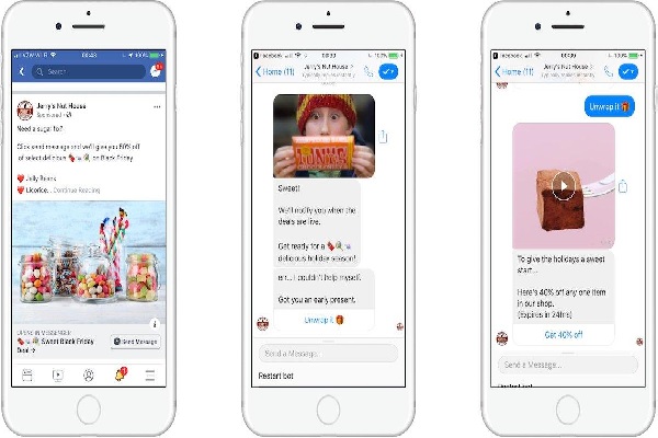
Key Takeaway: Measuring Qualitative + Quantitative Insights = An Ultimate e-commerce Customer Experience that Mirrors the Customer's Sentiments.
If experience is anything to go by, there are two ways by which you can provide a stellar customer experience. These are:
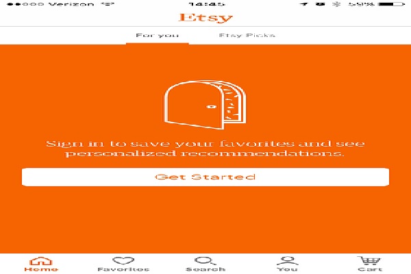

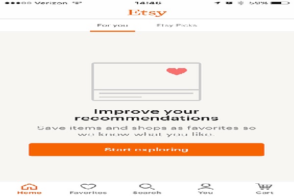
Step 1: Sign Up to get "Personalized Recommendations."
Step 2: Store "favorite" items to get better recommendations and return to buy later (if at all).
Step 3: Browse through "Editor Picks" if the "Favorites" section is empty.
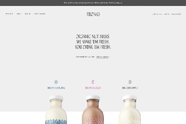
A. No sign up/login bugs.
B. No third-party payment platform failures. (A BIG TURN-OFF!).
Important: All ASOS did was remove the "Registration Process" from the page, and its checkout abandonment rate lowered by 50%!
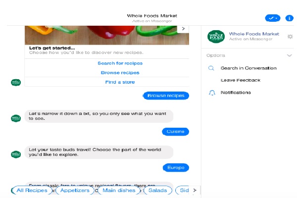
If you think real-time support is still optional today, think again. Here are the top-5 advantages of using a modern-day live chat support tool:
Key Takeaway: Continuous and relentless improvements (graphic, design, user experience, support tools, etc.) in customer experience can ensure your customers become voluntary brand ambassadors of your company's growth story.
“We see our customers as invited guests to a party, and we are the hosts. It’s our job every day to make every important aspect of the customer experience a little bit better.” - Jeff Bezos, Amazon CEO
Consistent CX improvisations and technological interventions across the multi-dimensional "Brand-Customer" digital interactions can make or break e-commerce brands today.
Gartner predicts that around 60% of "Innovation-First" companies are already looking into ways to build their AI strategies. In comparison, the other 40% have already adopted automated solutions into their existing e-commerce model.
The future of e-commerce customer experience rests upon futuristic technologies such as Artificial Intelligence (AI) & machine learning tools integrated with strategic customer experience enhancing strategies discussed above. So, if you wish to deliver meaningful value to your users to reduce churn and boost retention, try these tips and, above all, trust your instinct.
You’ll also receive some of our best posts today

Sam Makad is a business consultant. He helps small & medium enterprises to grow their businesses and overall ROI. You can follow Sam on Twitter, Facebook, and Linkedin.
If you are planning to dominate your industry in...

User reviews are a game-changer for e-commerce. Consumers rely heavily o...
Don’t miss the new articles!